
That's right, the logo designed by branding company HuskyFox.

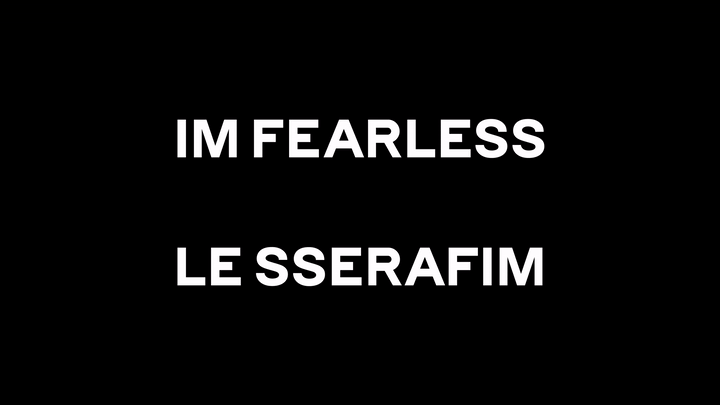

The name of the Le Seraphim team is an anagram (rearrangement) of the letters IM FEARLESS, and the logo was created by connecting the letters in a line.


Simple yet unique, it looks good wherever you put it and is highly versatile.


They won two of the world's top three design awards

"LE SSERAFIM logo, the world's top 3 design award 'Red Dot Design Award' main prize
a great feat"

"LE SSERAFIM Logo Wins 'iF Design Award 2023', One of the World's Top 3 Design Awards"
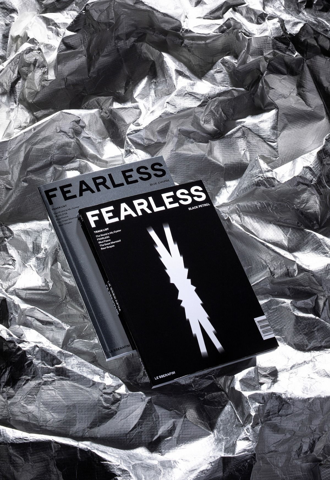
+ They had logos based on the different albums they released

original post: here
1. Why are their goods so well-made? That's so comparable to my bias
2. Wow it's so pretty and the goods are also sophisticated
3. It's so so
4. Wow they won the Red Dot
5. That's true, ever sine their debut, I thought it was well-made
6. The goods are so pretty
7. ㅇㅇ it looks unique
8. It's f*cking cool
9. It's good for making goods. It looks chic
10. Why does it sound like the company is trying to make them go viral so desperately..
New post

![[theqoo] EVEN CHINESE WOMEN TURNED THEIR BACKS AGAINST CORTIS AFTER THEIR CONCERT ft. SETLIST](https://blogger.googleusercontent.com/img/a/AVvXsEgpGHJx3__GVEBpdR9lRQ0jsnCwVawyK0-6ikUoJG1O8hJfJ_X9hHMx9-vuoKZEP-AS_As9_4uCtQZQAigglvvrMClsmwTQuBu2qXxROkCuKm_0FaDARrSzos9dBEMNxc-mnbjEGm24f4WjpRf3lOB2XX3UFKxScfDX81QY1VAnmdP_zEnFSEkBM9s0fdj-=w72-h72-p-k-no-nu)
![[theqoo] NEWJEANS HAERIN BEFORE AND AFTER LAMINATING HER TEETH](https://blogger.googleusercontent.com/img/a/AVvXsEgFIGA1DCwN9YjW1RxMcPu52RxGaCimMrNycniLsxG6WubCZnSAX4nhqOBl-DDQiHNbEYtZar__bzshrPlks6ZfDYdQ-T2x6bHdEs_cq6XJytYgE8x2V1tluTqYD1SLdBc9XGLEN4EimitsQYfp0rx-8F48932k2WPAjk0pstBlbmxPmmOYq2J-0yPSDWdf=w72-h72-p-k-no-nu)
![[theqoo] THE NAME OF HYBE'S NEW GIRL GROUP](https://blogger.googleusercontent.com/img/a/AVvXsEgdRInjUth99pXC-wQ1XMt-aVOB9CFuTrSFJy9L7j2HR27pDQ_UZ4LGpoOgAEFY_xgLbPSUHfH2CYSyMotYSplWjbRIPbam9np9ZCqrZZKy-Q4iaMCrh821GT5aSqLlbZwAO9XiyWo1VMRuFWZhYDJU1ck2zPjcHf5M3PAYuh36wRzQ06b91Orlu_CAA5Sc=w72-h72-p-k-no-nu)
![[theqoo] CORTIS CONCERT WHERE THEY LET THE DANCERS LOOSE ON THE FLOOR TO CREATE A MOSH PIT...](https://blogger.googleusercontent.com/img/a/AVvXsEjCSodyqpqyexYB7qHx3LJ9snvHLC3kldnXlKkuI846YVgy75-DYH0mB0HJyMVEa6fAG3C7GdwOIt-U_E_rsINKm6aJi2Z-BES0jsIZ3EZg-iT9P9eeODpV4AofrF7mbiiB-m5b8B80Dd1i7SgfCTgsrt0ULQLljj1_vz1Hl3NYdRYYv_2X54SAakPD0Ba9=w72-h72-p-k-no-nu)
![[theqoo] AILEE, REVEALS HOW HUSBAND CHOI SIHOON HAS CHANGED JUST 1 YEAR INTO MARRIAGE "HE WASN'T LIKE THAT WHEN WE WERE DATING"](https://blogger.googleusercontent.com/img/a/AVvXsEjQTM4Kr7NSgWOFnnHaVHY4__FH-NHfgNOxFVnbjFSHK7yqfKLqwIhTIy06vPmnof7ZL3yD8ZISXJqV3NXhS1hdO3hoQcCdpV_PXyrLYNKGZP_sFfzSk2prLrCIHSYe6w_TOcV5tXU5lwbSfjCV8e7cI0AitJP1WAcHafhx6Eq640l28J3jtPuCOc8HDhO1=w72-h72-p-k-no-nu)
0 Comments