

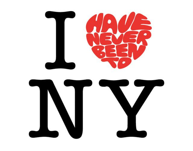
Everyone has seen I <3 NY
This is a logo/slogan made in 1977
People got so used to it that they barely think anything of it anymore
This logo is such a good promotional emblem and its selling factor is also legendary
It's been the symbol of NY for decades
Meanwhile, they spent $20M USD for 1 year and made a new logo
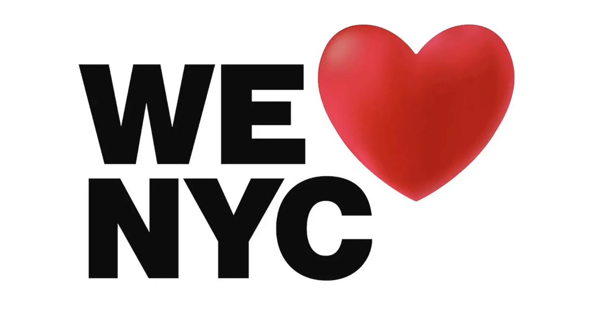
The majority of reactions have been:
- It doesn't even look like "We Love NYC" rather "We NYC <3"
- It just looks like we're using an emoji
- There's nothing unique about it anymore
- It feels like it was done in 1 minute
etc.
There are even articles written about how much New Yorkers hate it now ㅋㅋㅋㅋ
1. 20M...? Did they k*ll someone for this?
2. 20M ㅋㅋㅋㅋㅋㅋㅋ more like it took them 20 seconds to make it
3. ㅋㅋㅋㅋㅋㅋㅋㅋㅋ Why did they think it was necessary
4. Every time I read stuff like that, I'm only curious about where did the 20M go? Did they spend 20M to buy that font?
5. It feels like they didn't know where to put it so they just ended up putting it on top of NYCㅋㅋㅋㅋㅋㅋㅋㅋㅋ
6. Seriously whether it's there or here, we're all thinking the sameㅎ
7. Did the money go to the lobbyist?
8. This was 20M worth?
9.
10. Why did they touch it...

![[theqoo] I FIND IT FASCINATING HOW CELEBRITIES FLIRT THROUGH DMS](https://blogger.googleusercontent.com/img/a/AVvXsEjWJSd9Ru7wc_E8ujidjOwpw8huCy2o46SgoQi-onH3M_2BfHItwx7vJr1V_auoKuWT9S1luDF3_FpN2q_gxwe2o8-iVXxW5vvtm0WRMweOBrWPWrkbO4eonwAHNTvYwzHBoIYvUZ1sSCY_Z8Oyp6vv2Vf98VwCYWjT1aksbdBBJi9-DlflINCHkuwcxc2J=w72-h72-p-k-no-nu)
![[theqoo] [EXCLUSIVE] TWICE JEONGYEON, LEAVING JYP AND MOVING FOR BYUN WOOSEOK'S AGENCY? "RECENT MEETING"](https://blogger.googleusercontent.com/img/a/AVvXsEjbedIOHTrRxBNnRoTiC0Nqu28EYoEU00xl6mir40IPkdUo7j27rf74rGsYgZXZX3RrIWDm5h00AwL8c4MviMQqbyx4FE5tq1_BBzEgzAQnrQodZWfBqeRzxz_gh211lmjXFAk0T-Teu10pTbL0INkwAP9i_CjfNewOGUPTsjhmQQPBXuw8wlCVwxsFMShs=w72-h72-p-k-no-nu)
![[theqoo] AKB48 HANADA MEI'S SHAVED HEAD FULL VIDEO UPLOAD](https://blogger.googleusercontent.com/img/a/AVvXsEiPf-DdW5yrS-j0WVag6TOtl4PnKSUPyBY4vbsrU-BSngGTeF7NvDn7uqAfevWfZHO0F5YLwbz4v37II1BUmTa_-JZlx8tu5Nux9cqkIvmDi7e2ACuiOVNRs-nvZIxv3tqM8tkjX1rvHgsWVT6bj5-MFvIfa9XwRAub7h9HRwlUU0LHGrmlCwo0mfom384o=w72-h72-p-k-no-nu)
![[instiz] THE REASON WHY EX-ENHYPEN'S HEESEUNG LEFT THE GROUP](https://blogger.googleusercontent.com/img/a/AVvXsEj8MOj0z_MWVeTVBozWvIvdkiNI6tHD6MinOBe1G8s3lYXHbfgGQHOszsFJXImPhW4Dc4LQ_nqbj00PYjD2qztQ7TFG_i1mT4ej3Z1FcdtjLEhdUq0kGQh1Q28O50BWHi7anOOE5AqCO9uVdwQlnD2jCwR_j0JpcnhvHgwJK5TRfHtz4q9umZzsEstLOq_Y=w72-h72-p-k-no-nu)
![[theqoo] THE CURRENT SITUATION OF THE LYRICS IN CHALLENGE FEATURING MARK, WHICH WAS POSTED TODAY](https://blogger.googleusercontent.com/img/a/AVvXsEgG-_g6-6_dmCTu7-arDH0KwRh9qcir-lUJLDGtFBoFCPv91zSvysCA7RDsCNu-bcZIE-fv6uVAO_dtgFI7eV2DkwBJLUUS76H12vZ01R-sde1m56xUiNOFqhAyR-R-RASF-QOyLu-UJxbJUKpOVjJndaGr_5NH0Too-_F-1ZjQG_yFGdXs-ZdKC62SZNGJ=w72-h72-p-k-no-nu)
0 Comments